
Remember when websites were simple black-and-white text with the occasional pixelated image? Those were the dark days of Netscape and Ask Jeeves.
Luckily, we live in better days of beautiful websites with animated functions, embedded videos, and colorful text.
That's why if your event website looks anything like one of these monstrosities, it's time for a lesson on what your website should look like and what it needs to maximize engagement.
I've gone through some of my favorite websites for event management conferences and pulled visual examples for each point—because what better example than event professionals themselves?
Here are five ways to creatively display the necessary information your event website needs, in a way that improves user experience and maximizes conversions.
1. Place your event name, date, and location front and center
The first thing a visitor's eye should be drawn to when they enter your website is the name of your event. It should be in big, bold letters, and preferably in the middle of the page so there is no confusion over what site they are visiting.
ILEA Live does this perfectly with their name front and center and all important information right below it, making the user's experience much easier.
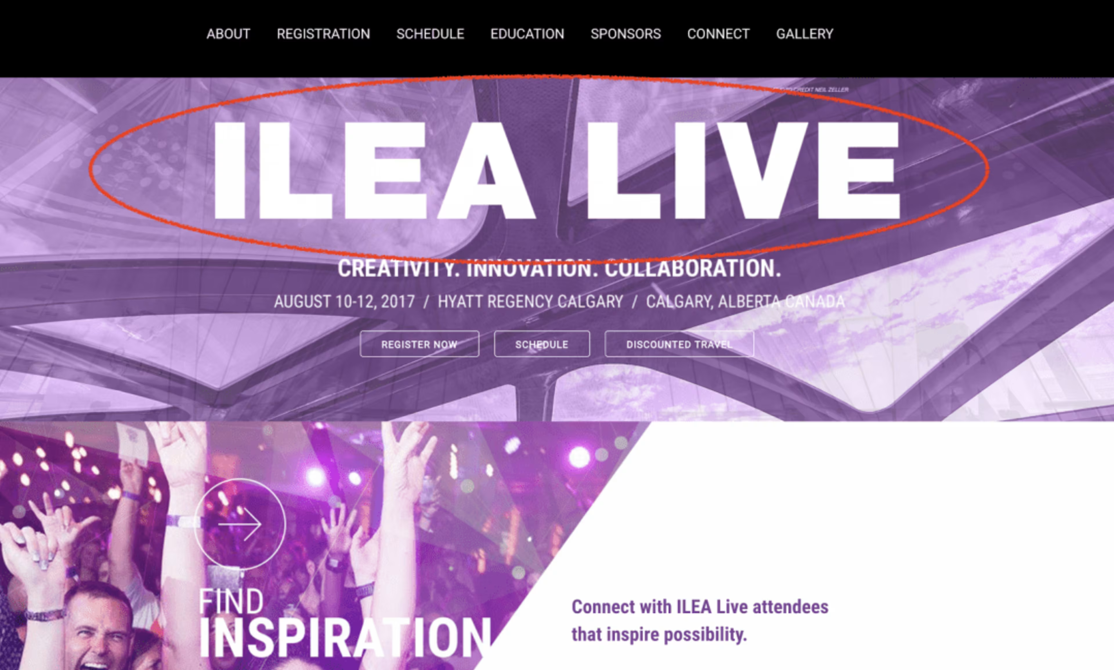
Title front and center on event website, via ILEA Live
Just as important as your event title location and font size is the correct heading usage. In order to maximize your SEO, make sure that your event title is set to the “" header format in HTML so Google knows what the subject of your event website is. Set subsequent information below the event title to “, , etc." so Google doesn't confuse your locations and dates with the main subject.
The purpose of properly designating your headers is to ensure that Google correctly lists your event in their search results as the event name and not some other text on your website. Otherwise you'll end up with less-important event details as a search result, leading to lower SEO rankings and fewer site visitors.
2. Make your registration button easy to find
This one is pretty self-explanatory. If your website visitors can't find where to register, that event registration software you invested in is useless.
Your registration button should be easy to find without any scrolling or click-throughs. This ensures that website visitors don't have a hard time registering, or worse, bouncing (leaving) your page before signing up.
The Special Event does this effectively—they skew it to right, and the registration button is a contrasting color from the main purple.
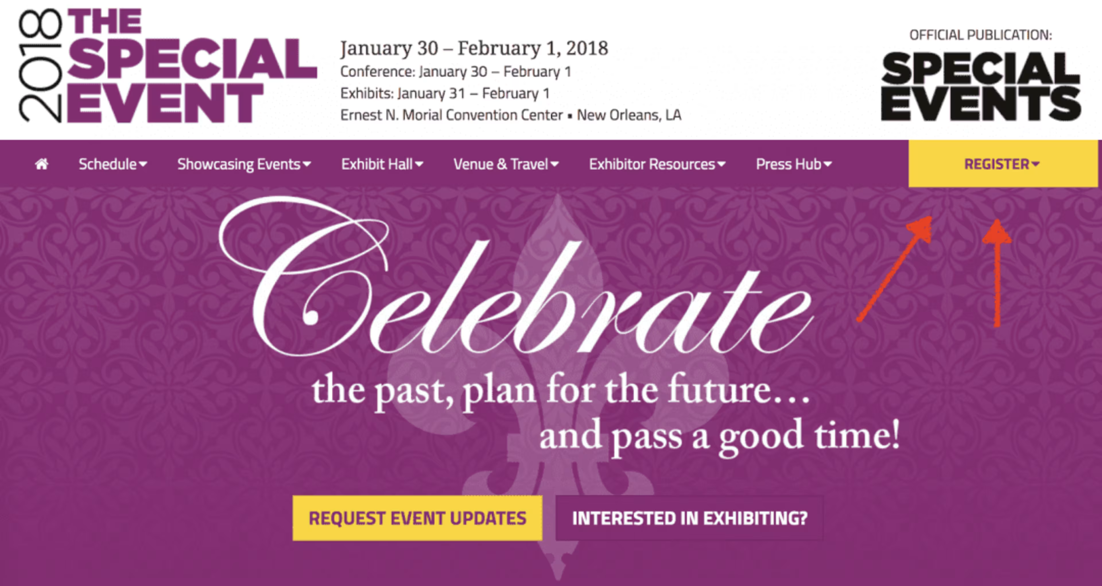
Registration button stands out, via The Special Event
ILEA Live also does this right by placing their registration button right below the title, date, and event location.
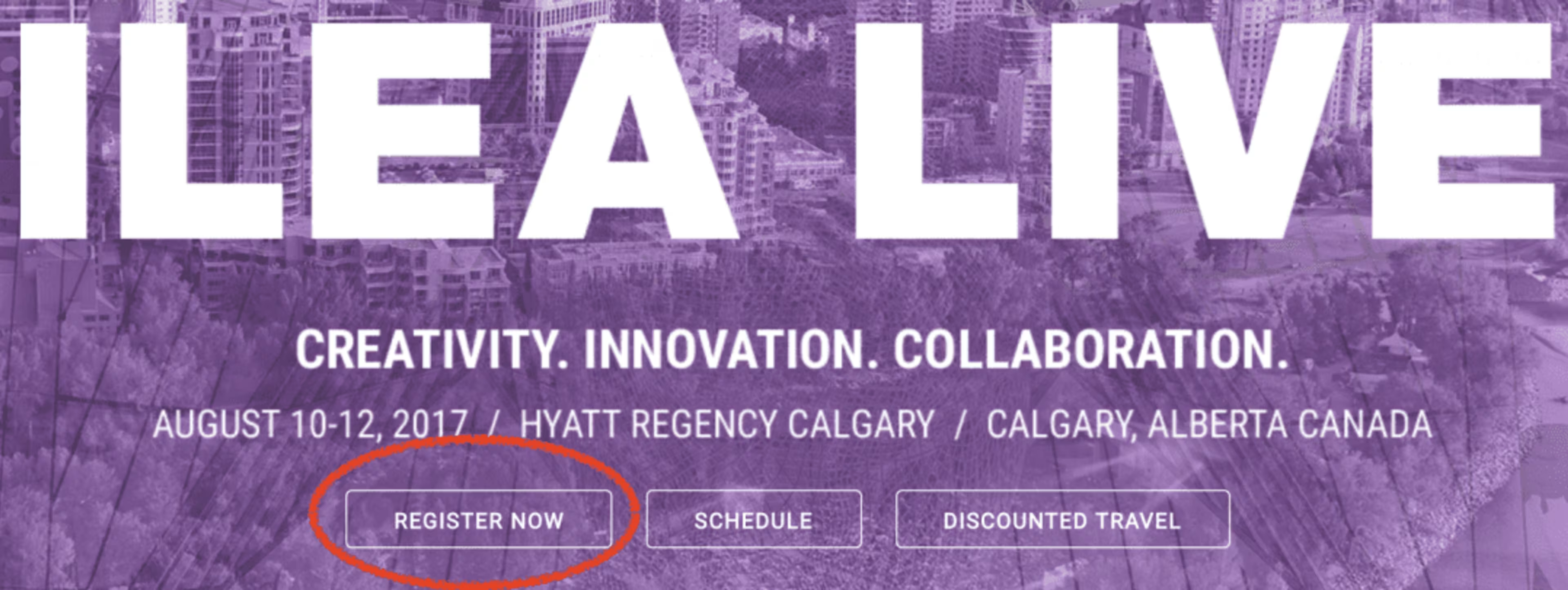
Registration button located right under important information via ILEA Live
A scrolling button that moves along with the visitor as they navigate through your site is another effective way to do this, as well as placing a registration button as a call-to-action after important sections of information.
3. Use interesting visuals to promote your event
Visually appealing websites have a higher engagement rate and lower bounce rate. In fact, visitors to your website will form their opinions about your website in as little as 17 milliseconds!
The truth is, aesthetically pleasing websites are easier to navigate and make important information easier to pick out.
There are different types of visuals you can use for your event website. For instance, ESPA Live uses an image of Nashville, where the event is held, as their header image.
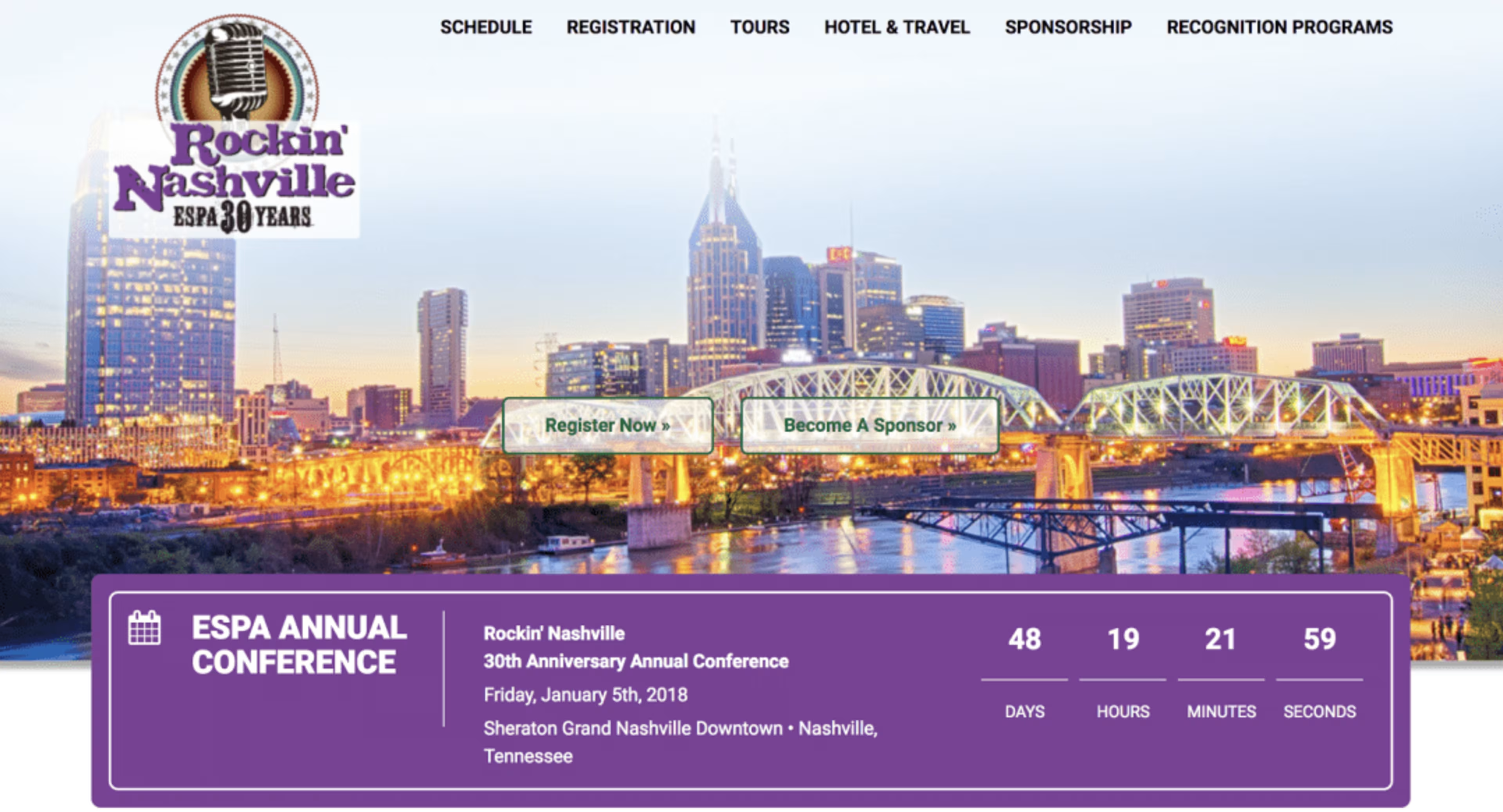
ESPA shows a beautiful Nashville skyline, via ESPA
Other event websites use images from previous years, such as crowds of attendees or keynote speakers, like Techsytalk.

Room full of attendees via Techsytalk
Using images from previous events acts as a preview of what's to come if they sign up for your event.
If you need to design website graphics, websites such as Canva and Pixlr have free tools and templates for all kinds of visuals.
Finally, you can use videos on your event website that list the headline speakers, the standout details that make this event different from the rest, a registration call-to-action at the end, or like this Techsytalk video, footage from previous events as preview of what's to come:
Techsytalk promo video, via YouTube
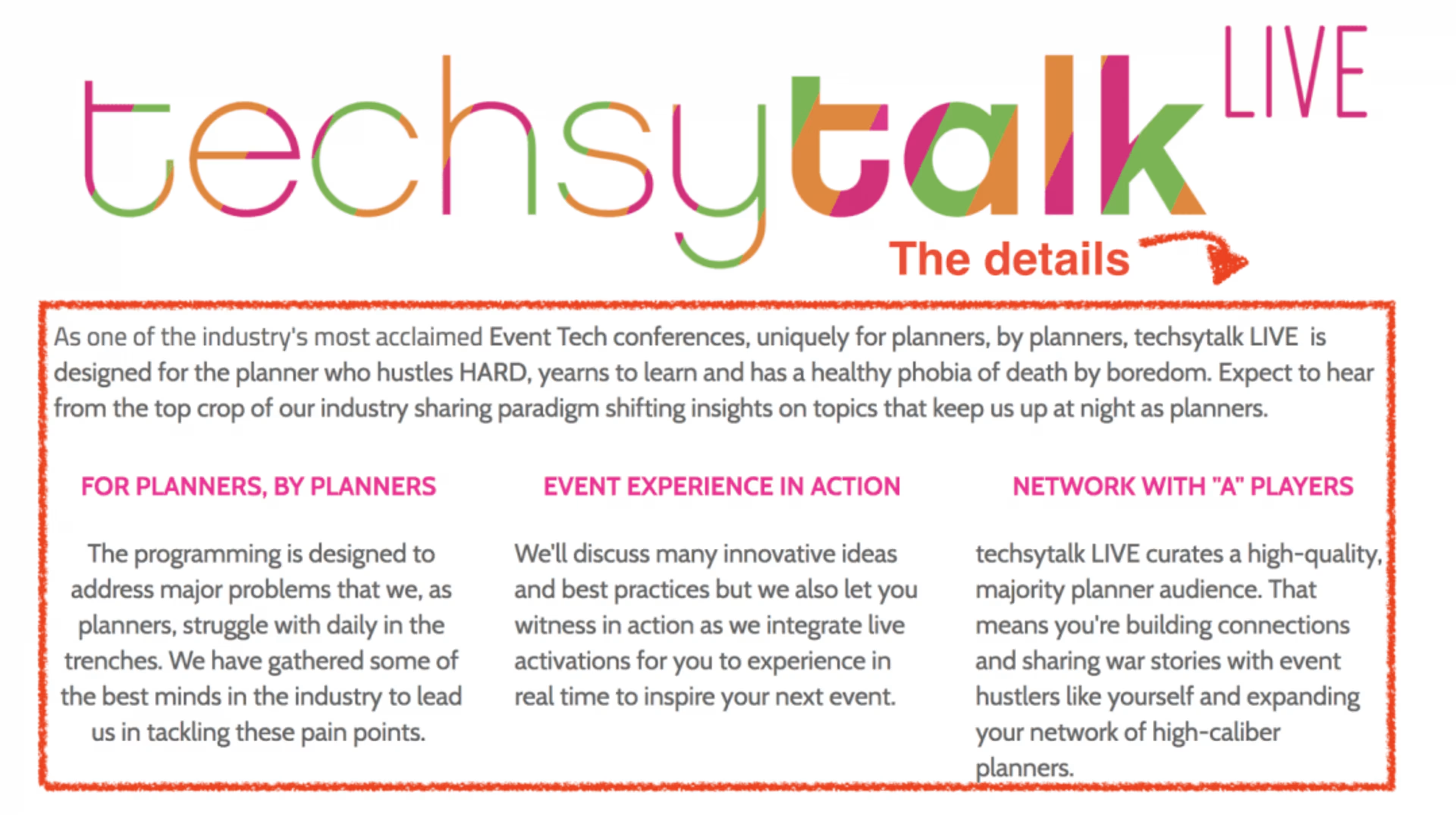
4. Include detailed event information on your homepage
Once your visitors have seen all of the basic information at the top of the webpage, it's time to get into the nitty-gritty details. When your visitors scroll down they should be able to find a list of speakers, links to the event schedule, sponsors, and summaries of the event.
Techsytalk does all of these things once you scroll past the event title and registration button. They even include ticket prices on the main page so event attendees will know what they can expect to pay before they even click “register."
Everything else you need to know:
Event details via Techsytalk
Who we're here to see:
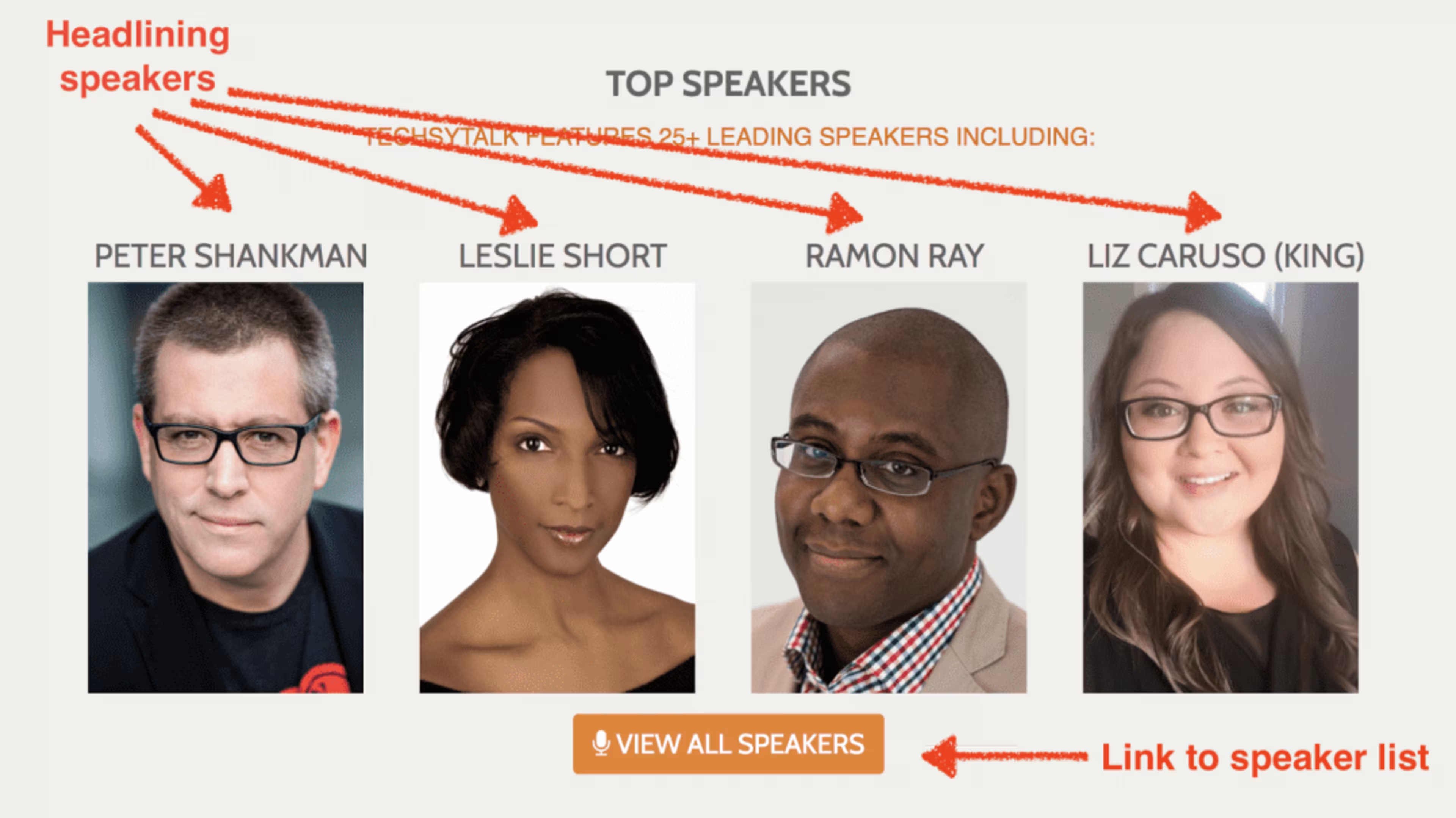
Event speakers via Techsytalk
What you should expect to pay:
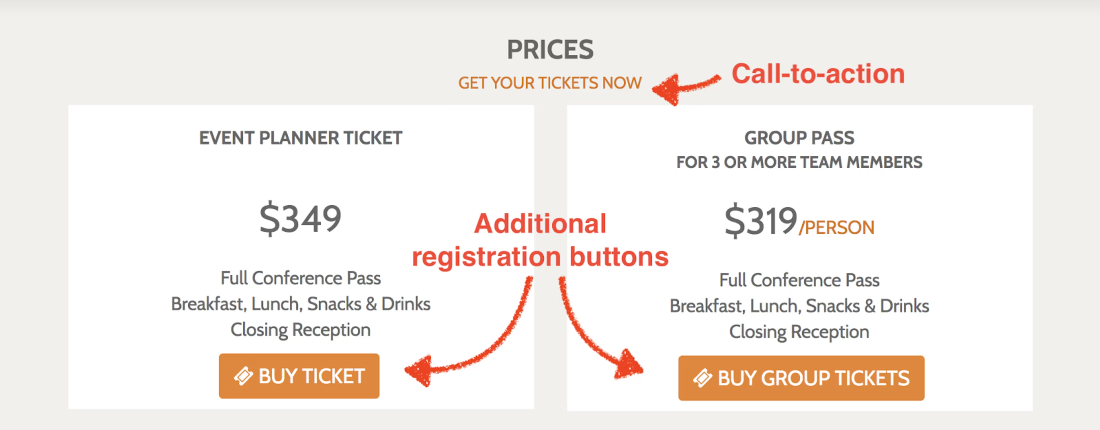
Event prices, packages, and registration buttons via Techsytalk
And any additional information:
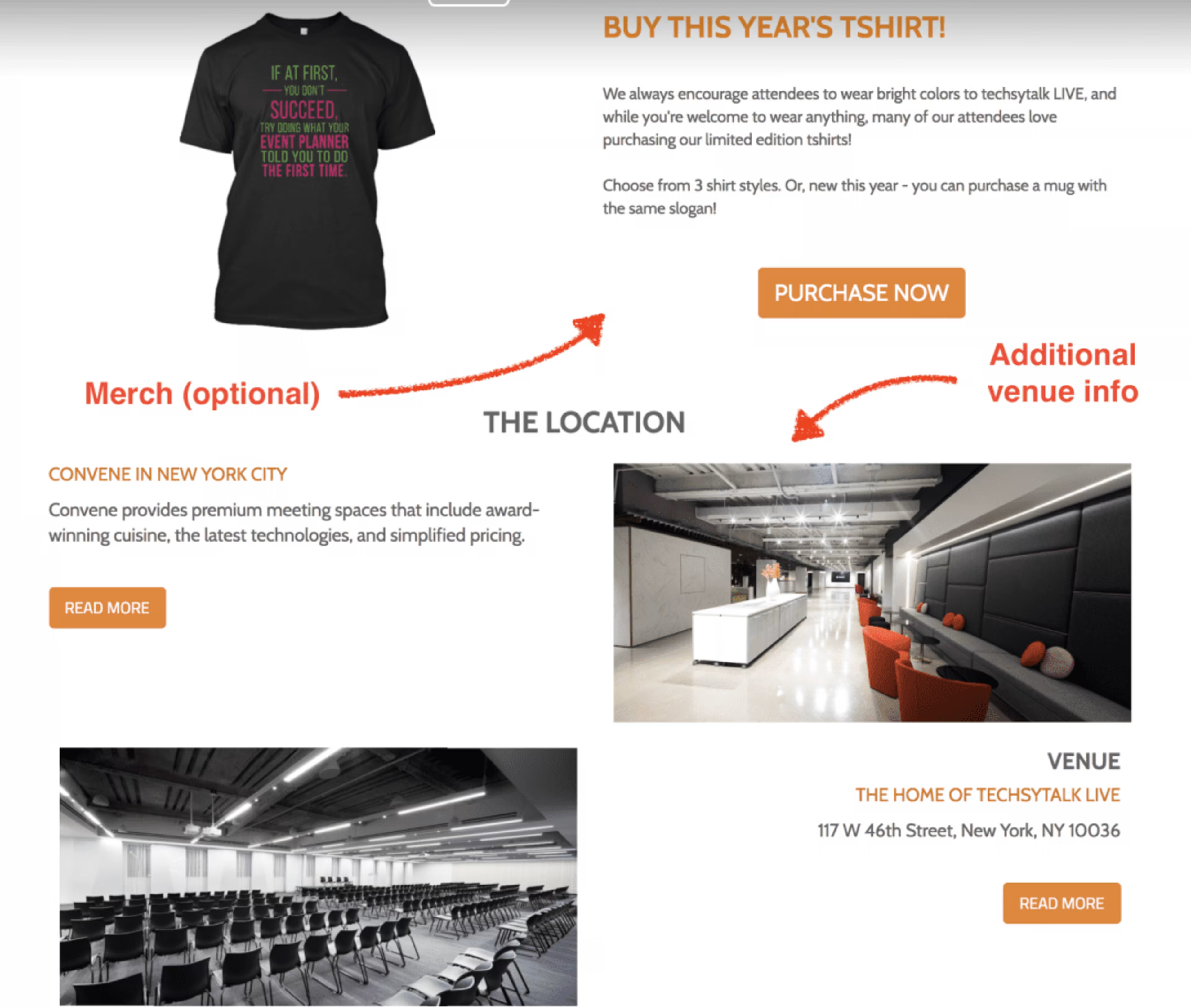
Merch and venue information, via Techsytalk
The point of all of this is to make your event website visitor's experience as simple and streamlined as possible. Providing information on your homepage without having to click through links to find it makes a visit simple and improves your SEO with Google.
5. Include contact information and social sharing options
Your visitors should be able to easily communicate with you if they run into any issues with the registration process or have questions about your event. Your event website should have easily accessible methods of contact, whether through a contact form, an email address, and social media buttons.
ILEA Live includes their contact information at the bottom of their website, which is a very typical spot for contact information. They also provide social media links so attendees can keep up with event news.
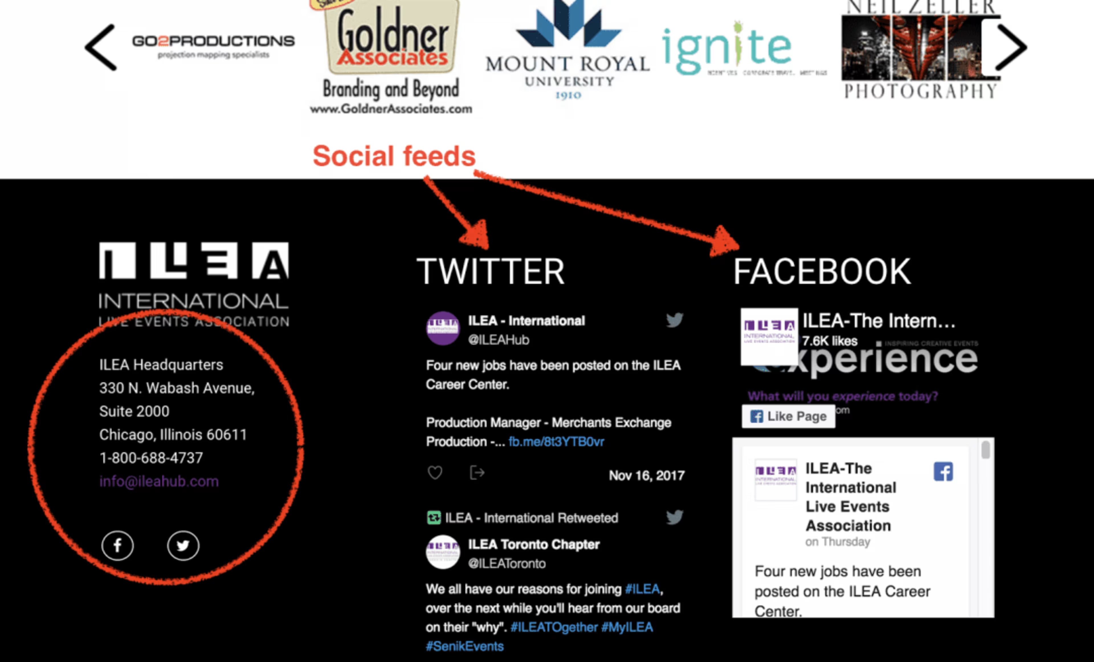
Easy-to-find contact information via ILEA Live
Techsytalk makes the social media experience on their website simple. Just a short scroll down and they include links to their social media right under the event summary. The only thing their main page is missing is other forms of contact, such as an email address.
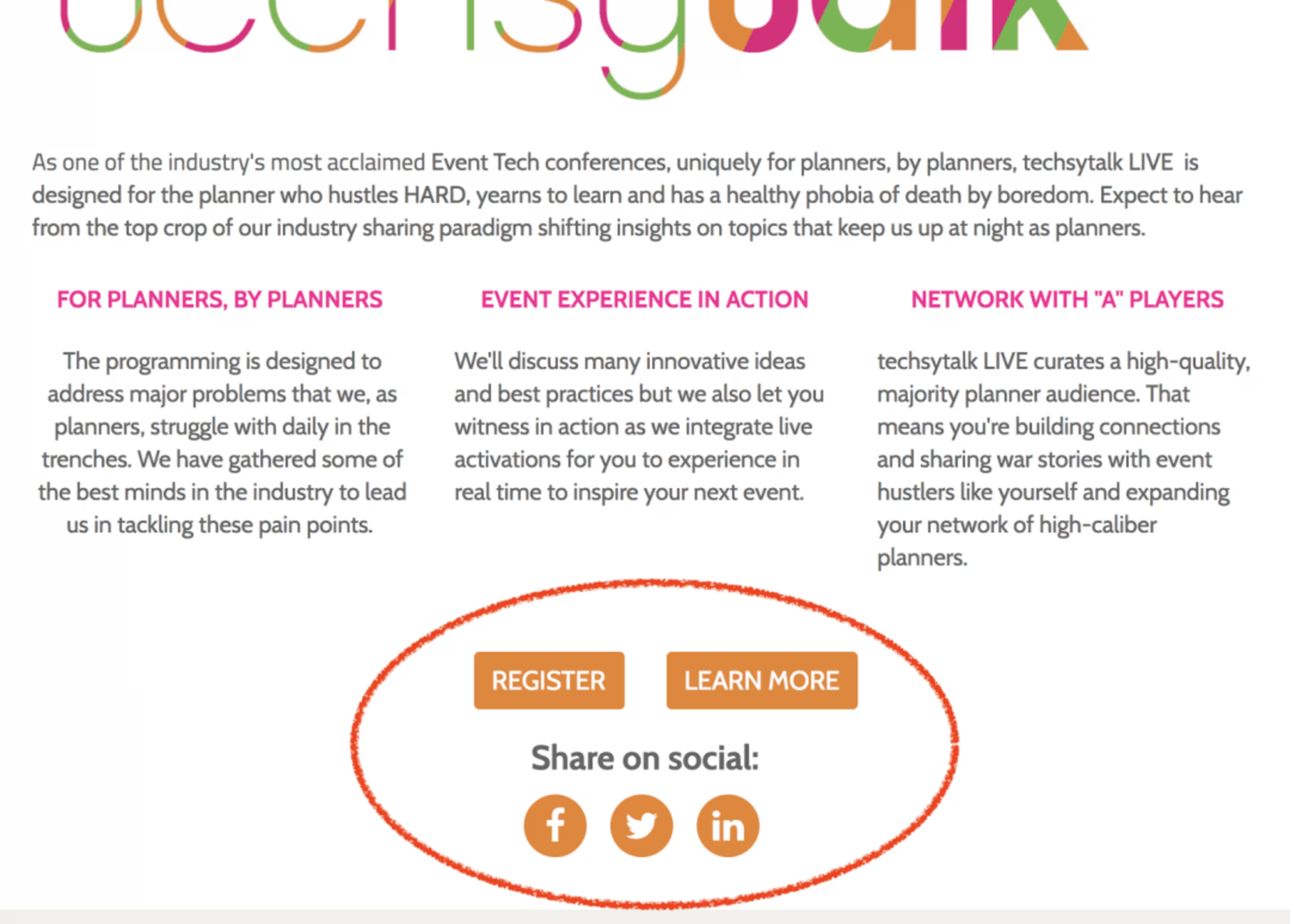
Social media buttons, but no contact information, via Techsytalk
Attendees can contact you via Facebook, Twitter, or LinkedIn, but it is far more direct and personal when done through email or through contact forms. Don't forget to include that direct line of communication.
Depending on your needs, you can hire services for help building a website. Check out our hiring guides for web design companies and web development companies to determine which one would be a better fit for you.
Other event management best practices
An engaging and visually interesting event website is just one part of the equation when inviting guests and hosting your event. If you enjoyed this guide on event websites, there are plenty of other best practice guides on the Capterra event management blog that will interest you:
3 Productivity Tips for Busy Event Planners
Everything You Need to Write an Effective Event Planning Business Plan
The Ultimate Guide to Fostering Relationships at Your Networking Event