
BI reports are one of the most crucial aspects of any BI implementation. If set up improperly, these reports can cause confusion and even, in some cases, misguide their own end users. In other words, the system might not make sense to the people who need it most.
On the other hand, well-designed BI reports and dashboards can help you quickly derive critical insights and discover hidden patterns in your data.
Here are seven things to keep in mind when designing BI reports for your organization, in order to maximize the return on your reports.

1. Identify reporting requirements
The first step is to make an exhaustive list of all the stakeholders, decision makers and end users for your reports. This will give you a clear idea about the target audience of your deliverables.
Schedule interviews (via face-to-face meetings, phone, or Skype) with relevant stakeholders to gather all the reporting requirements from them. These meetings should include all the executives, managers, and data analysts who will actually look at your BI reports regularly.
Ask the following questions during these interviews, to understand how your target audience hopes to use your reports:
Which reports do you use currently? Do you need or want any additional reports or information?
Why do you need this report?
Who will use this report?
What type of device will they use to access the report?
How frequently will they use this report?
You may not be able to meet with all the stakeholders at the same time. In such cases, avoid making do with written specifications or emails. Instead, schedule a series of face-to-face meetings and follow ups with each user group to completely identify all the requirements. This will help you discover conflicting or even contradictory requirements and resolve it upfront, saving a lot of time down the road.
2. Identify the KPIs and metrics for each BI report
Next, create a list of KPIs and metrics that you want to display on each BI deliverable.
Schedule interviews with relevant stakeholders to find out what they want to see in their reports.
During these interviews, ask them:
Which metrics and KPIs do you currently monitor for your business processes?
Which reports do you use to track these metrics?
Do you have sample reports for reference?
What data would you like to add to/remove from these reports?
Most businesses already have a reporting process in place. It's just that users are not happy with it, either because it doesn't provide the required information, or because it's an error-prone system of Excel workbooks being prepared manually or using ad hoc scripts.
The key is to analyze their current reporting systems to get an idea of what they are currently tracking, and identify areas of improvement. Avoid asking them directly what they want to see in their reports. It will only confuse the end users.
Once you have a list of metrics that you want to display on your BI reports, ask yourself:
What are the data sources for each metric?
Do you have all the data available?
Will you need to obtain additional data from external vendors?
Are these metrics readily available or being calculated in your BI system? If not, can you build new processes for them? Reach out to your BI team for this.
In case of any concerns, go back to the stakeholders to discuss possible next steps. It will take two to three iterations, but by the end your users will have a good idea of what to expect in your BI reports.
3. Choose the right visualization for each metric
One of the most common mistakes people make while presenting information visually is to use the wrong chart or visualization. It not only conveys the wrong message, but in some cases, might even lead to confusion.
Here are two charts that show the same information. Which one do you think is more intuitive?
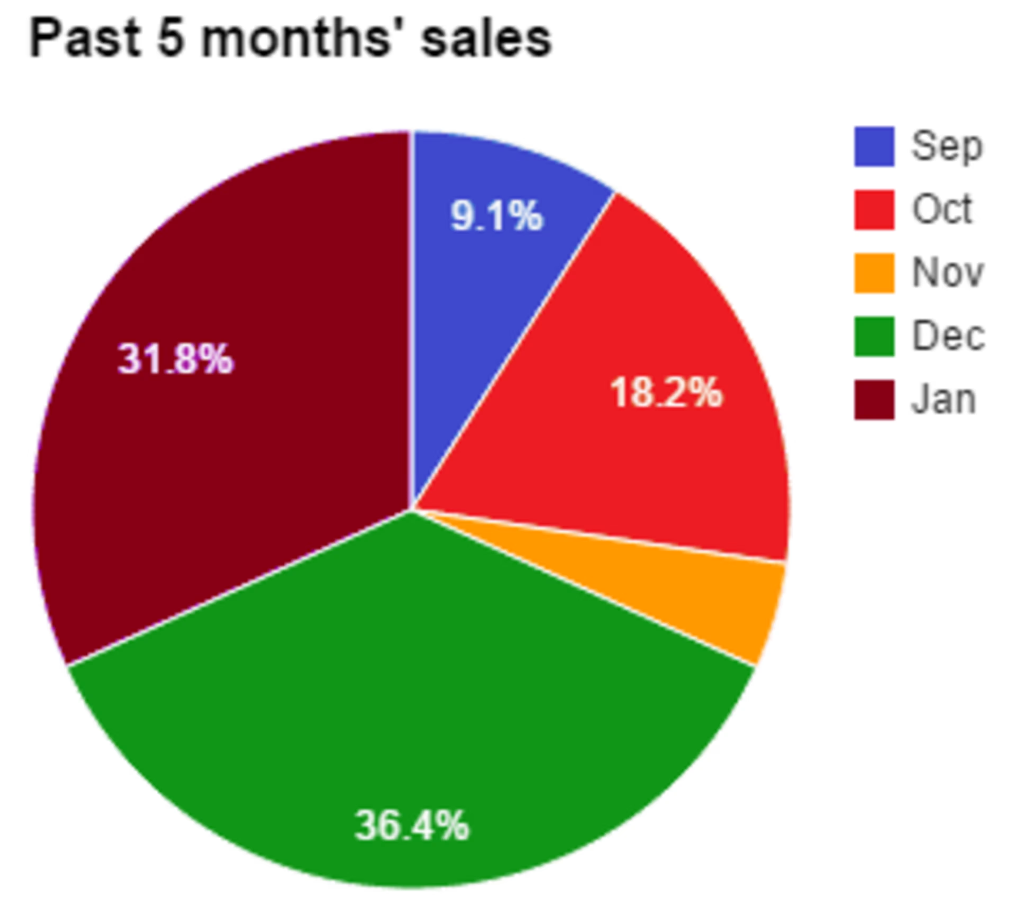
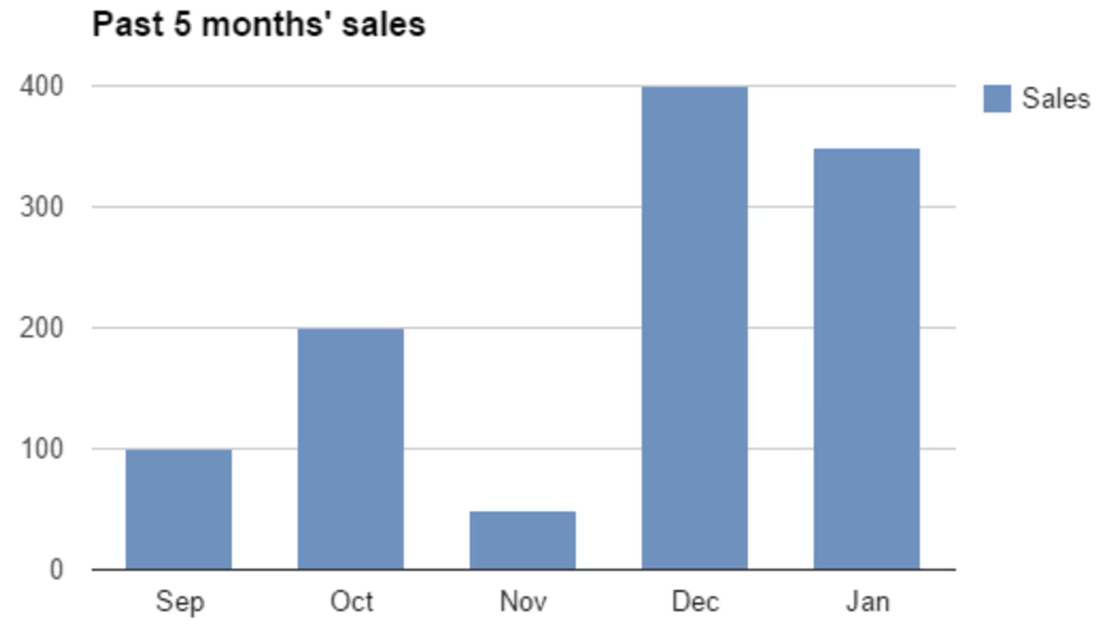
Choose a visualization that supports the underlying data
In the first chart, the viewer is bound to waste time going back and forth between the chart legend and pie slices.
On the other hand, the second chart makes it easy to spot the sales trend even without looking at the actual numbers.
For each metric, it's essential to choose a visualization that supports the underlying message in your data.
Below is a flow chart to help you decide which visualization to use to present your KPIs and metrics, depending on what kind of information they contain.
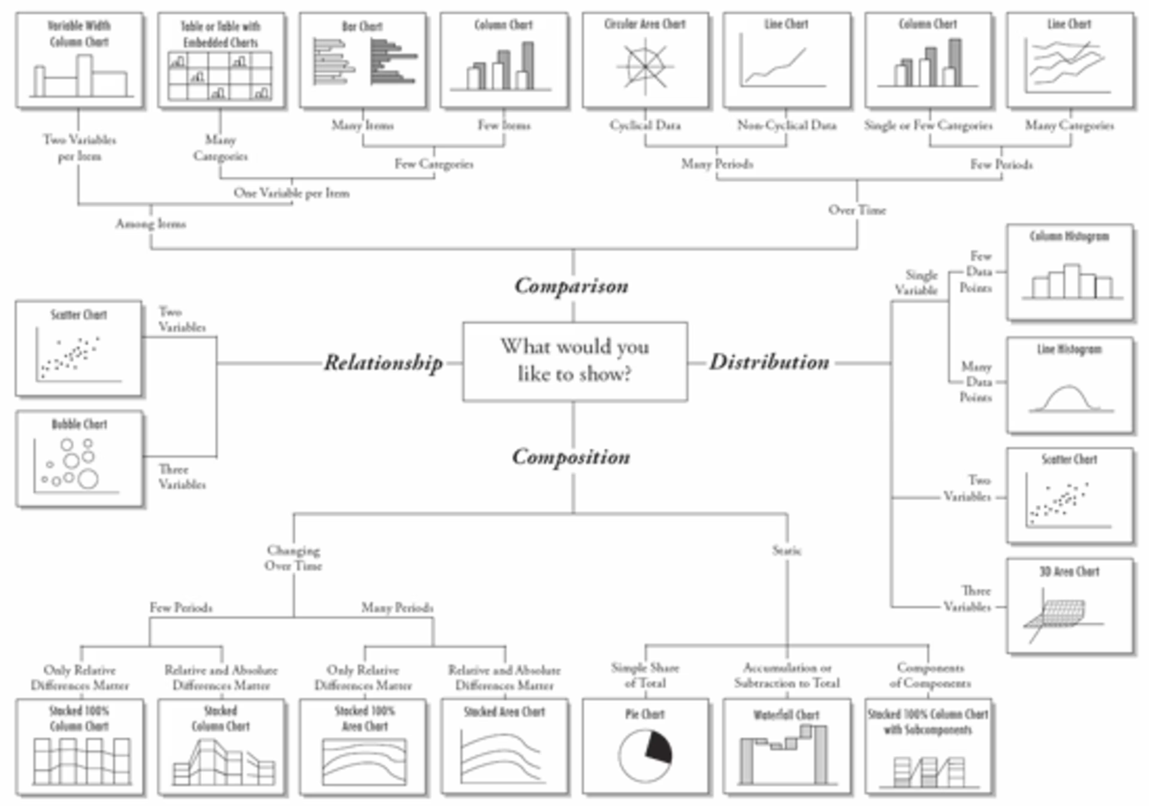
Find the right chart for your data (Source)
4. Lay out the report elements in your BI reports
Once you've figured what (metrics) to display on your reports and how (which visualization), it's time to arrange them in an easy-to-understand manner to design your report mock-up.
We know from various eye-tracking studies that when humans read web pages, our eyes start from the top left corner of the page. As we read the page content, our eyes move from left to right, forming F- or Z-shaped patterns.
The key is to leverage this natural reading pattern to our advantage to present information in intuitive manner. Display the most important and urgent information on the top left corner of your reports. Low-priority and slow-changing information should be displayed in the bottom half of your report.
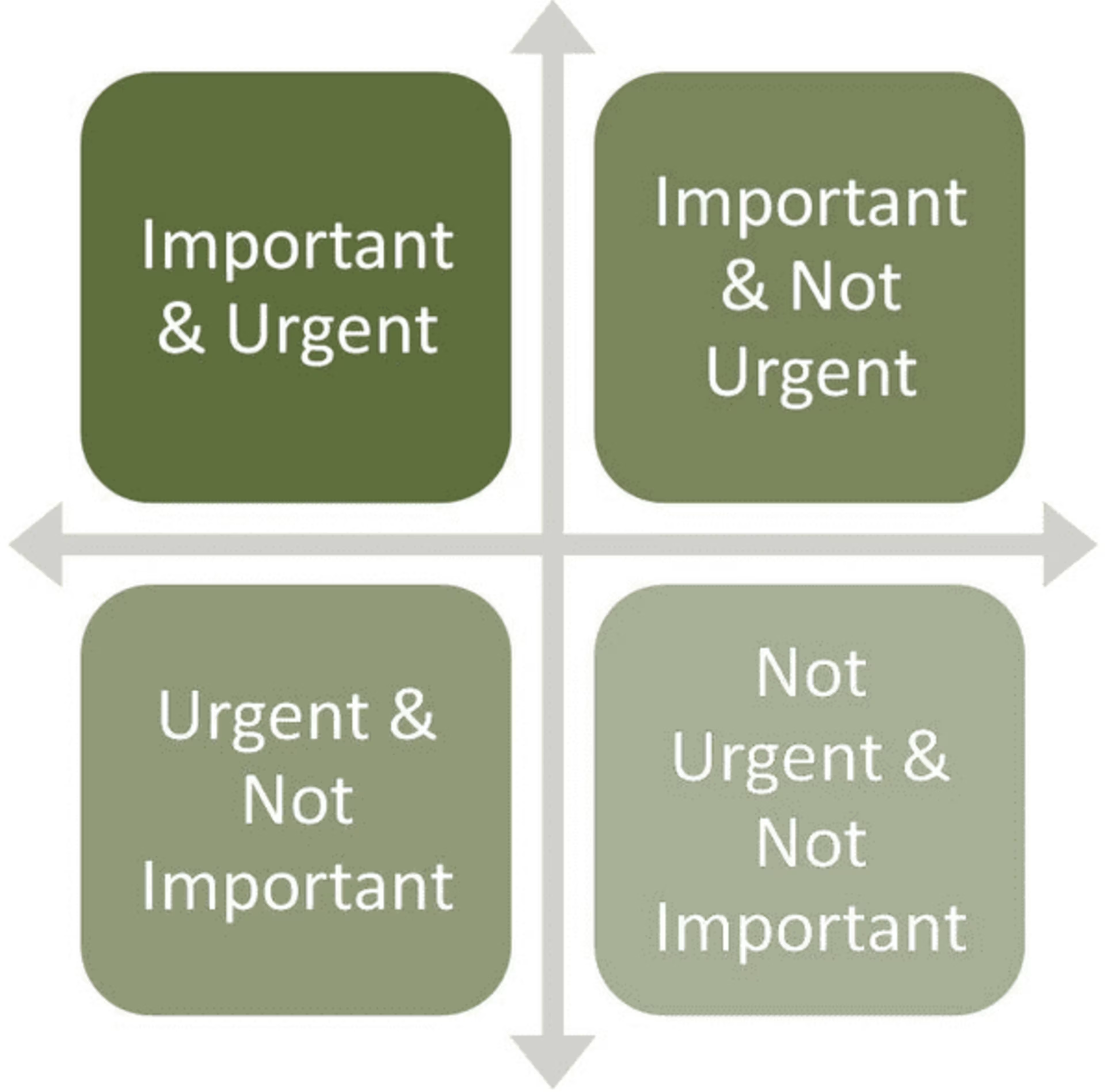
Display important and urgent information in the top left corner of reports
Here's an example of a poorly designed BI dashboard:
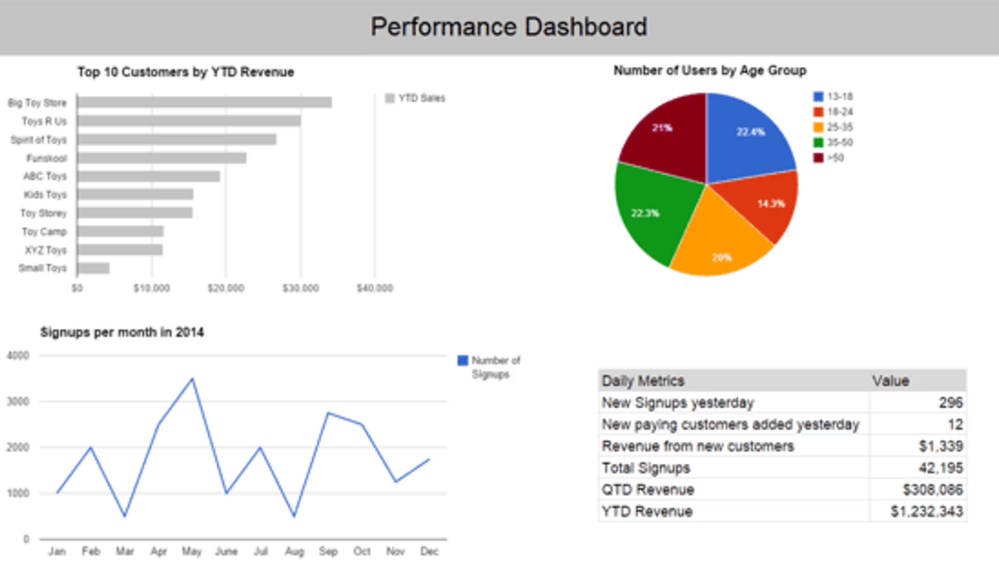
A poorly designed BI dashboard
The top two charts (“Top 10 Customers by YTD Revenue" and "Number of Users by Age Group") don't change frequently.
On the other hand, frequently-changing tables such as “Signups per month" and “Daily Metrics" have been placed at the bottom.
As a result, every day an end user looks at this report, he/she will have to go through the top two charts, which look the same most of the time, before getting to the information that changes regularly.
5. Highlight key information
BI reports are packed with a lot of information and can quickly become visually distracting. Guide the software's users to the right numbers and trends, using visual cues.
Using the right colors is a powerful way to highlight critical information on your BI reports and dashboards.
For example, when you look at the following dashboard, where do your eyes go to?
Use colors to draw report user's eyes to key information
Perhaps you looked at the pie chart at the bottom right, or the line chart at the top left region, because of their colors. That's exactly what this chart should inspire you to do. With that said, avoid using too many colors as it can lead to visual noise.
It's also important to remember that some colors are more eye-catching than the rest. So if it makes a particular chart or visualization stand apart, then according to Gestalt's Principles, we pay more attention to that report component and try to figure out why it's different.
For example, the two charts below show the same information:
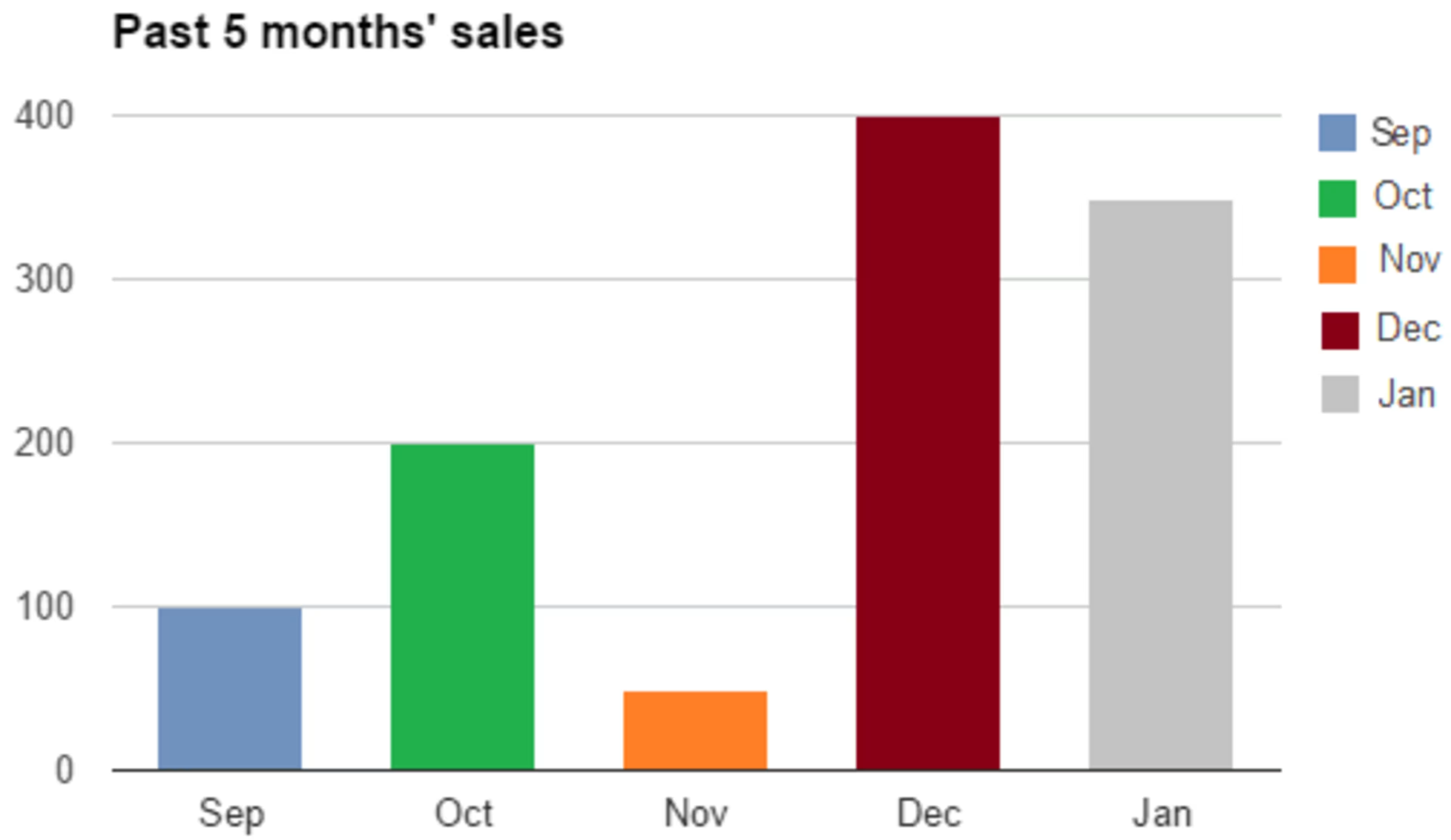
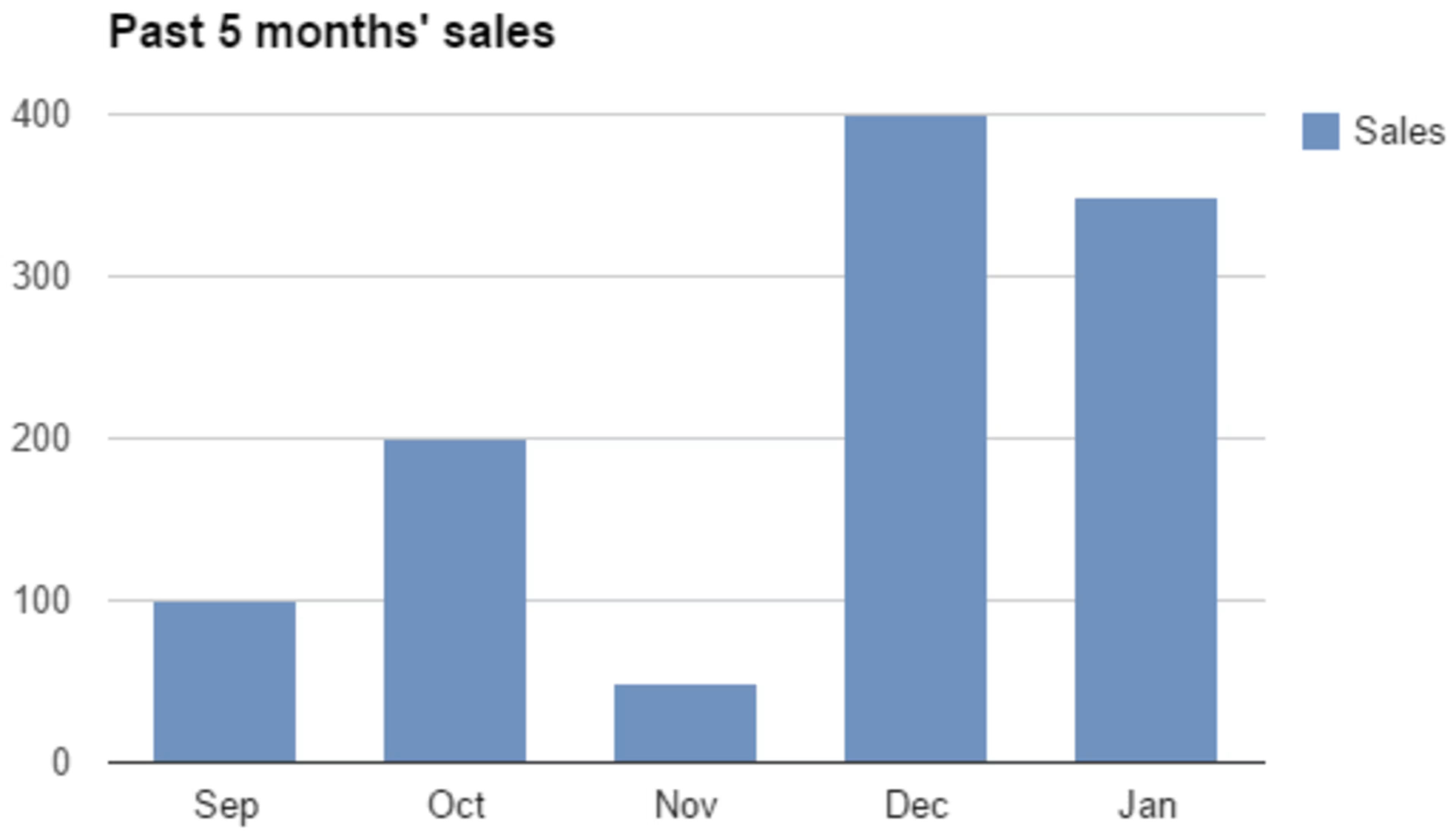
Using colors to highlight information in a graph or chart
However, the additional colors in the first chart don't provide any additional information. On the contrary, they make us think “Does green mean something good happened in October?"
In the second chart, the use of a single color tells us that all bars measure the same metric (i.e sales). It also helps us see sales trends and draw comparisons.
So the key is to use colors strategically to highlight the key pieces of information in your BI reports and subdue the unimportant/non-urgent ones.
6. Group related KPIs and metrics together
Since BI reports are used to derive insights and take action, it's important that they help end users quickly draw connections within the data.
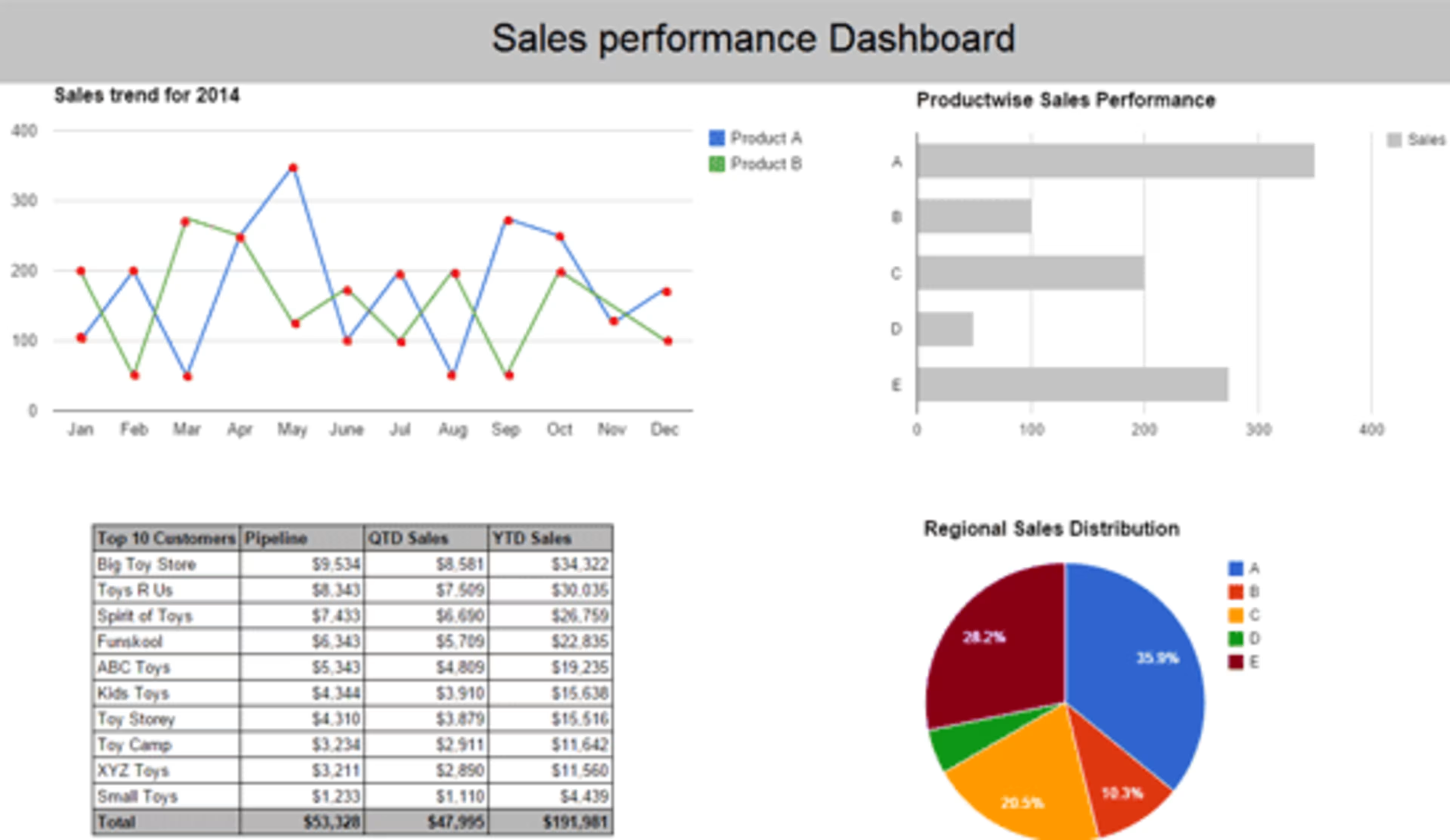
One of the most effective ways to do this is to group related information and place that information together. Look at the dashboard below:
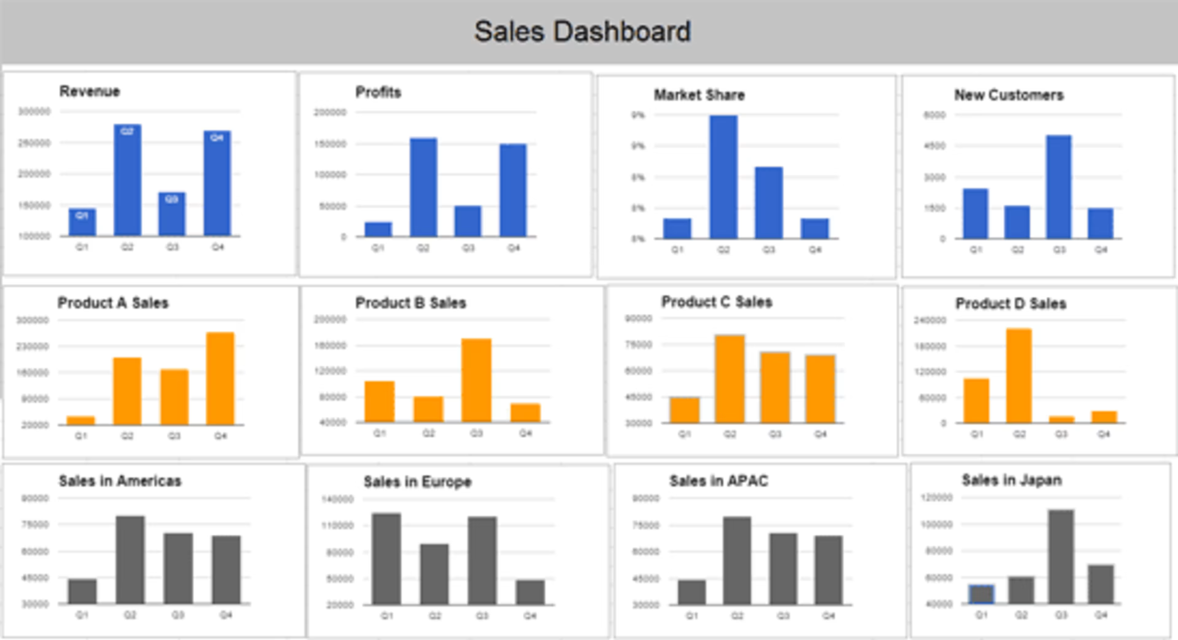
Group related information together to show connections
In the above dashboard, the color and position of charts allow you to quickly understand and compare related information:
The first row contains information about overall metrics such as revenue, profits, market share
The second row shows sales metrics about individual products
The third row presents regional sales information
On the same note, if you place related information far apart, it can cause confusion and make it difficult for users to see the connection.
7. Get a sign off on the mock-ups
Once you are happy with the mock-ups, go back to the stakeholders and get their approval, as they are the ones who'll be using your reports on a regular basis.
Ensure that they understand the information presented in your reports, and also how to use them. For example, if your reports have interactive features such as drop downs, filers and drill-downs, then ensure that the end users know how to use them to get the information they need.
This is an iterative process which can take weeks or even months, as the stakeholders may not be sure what they want see on their reports, or how they want it presented. It's advisable to cap the number of report review meetings and communicate it upfront. For example, we typically have up to three report review iterations with our clients, over a period of one to two months.
Most importantly, get a formal, written sign off for your mock-ups so you can begin building the actual reports. This will help you ward off unnecessary iterations that have the potential to delay your project. Otherwise, you'll keep getting change requests throughout your implementation.
Wrapping it up
Well-designed BI reports make it easy for end users to get the information they need to do a better job—whether it's monitoring daily operations, running ad hoc analysis to investigate problems, or exploring data for new growth opportunities.
The key is to understand your target audience—who they are, what problems they face, what information they want, and how they will use it. Once you figure this out, present the information in a way that enables end users to quickly draw insights and make decisions.