

Unlocking the power of your BI software can be a struggle, but we have the solution.
Business intelligence has the potential to uncover data insights that can propel your business to new heights of growth and success. But if you’re still learning how to make the most of your new BI software, simply unlocking that potential can feel like a struggle.
Jen Larson, director of marketing analytics and research for Pennsylvania State Employees Credit Union (PSECU), is familiar with this struggle, and how to overcome it.

Jen Larson, director of marketing analytics and research for PSECU[1]
We recently sat down with Larson to chat about her business intelligence strategy in order to help other businesses make the most of their BI software. To summarize what we learned, new BI software users should focus on simple, visually aesthetic dashboards; consistent, interactive data visualizations; and gathering data to feed advanced analytics in order to make the most of their new BI software in the short term and long term. Read on for more details on how to put this strategy into action.
Looking for a primer on business intelligence technology before diving into specific features? Check out our business intelligence software directory which includes a guide featuring benefits, typical features, and more.
1. Use dashboards to pull many reports into one location and save time for end users
When Larson first joined PSECU back in 2020, she spoke to different department leads to figure out what kind of problems they were struggling with.
“A common refrain that I heard when I first joined PSECU was the complaint that (users) have to go to 17 different reports all over the place in order to get all the information needed to answer a question,” she said.
The solution to this problem wasn’t easy, but it was obvious: dashboards.
“Dashboarding has allowed us to bring all of those different reports and different numbers all over the place into one area where (users) can go to answer one problem or question,” Larson said.
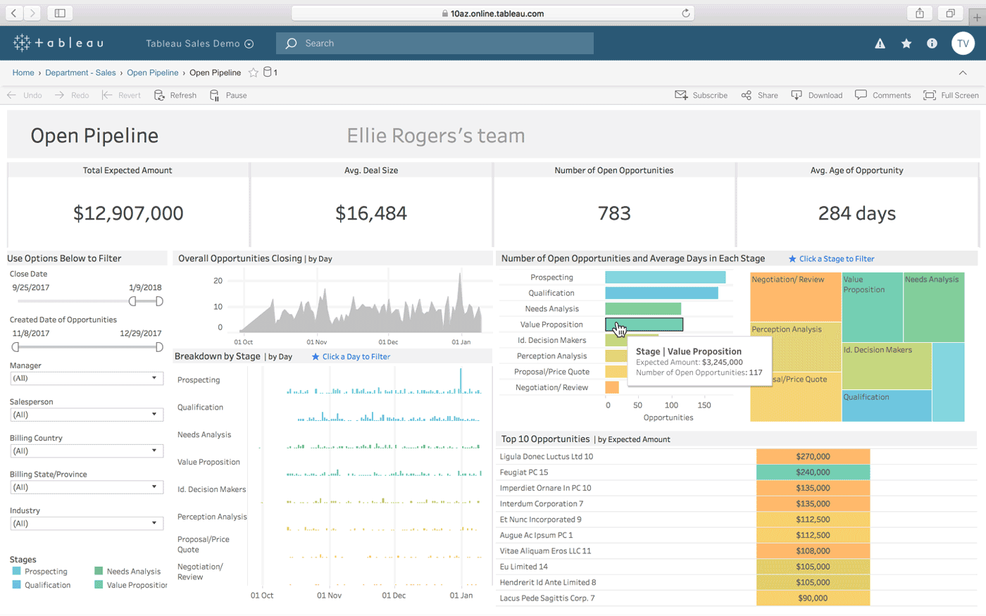
An example of a dashboard displaying multiple sales reports in Tableau business intelligence software[2]
feature overview
Dashboards allow analytics users to compile multiple charts and graphs on a single page. This can help teams save time and improve clarity through the ability to track multiple metrics without needing to search through multiple reports.
Larson says that dashboards are her primary tool for empowering PSECU leadership to make better data-driven decisions. And her north star for using dashboards is to ensure that they’re clarifying and not confusing.
“For me a good dashboard answers a question,” she said. “For example, you wouldn't want a report or visualization that's looking at things from the loan perspective on the same dashboard as things looking from the member perspective. You want someone to be able to look at a dashboard and the visualizations and reports on there and say ‘OK, I know that this is a place I can go to answer these types of questions.’ “
When Larson first joined PSECU, the organization’s member demographic was located in “15 different reports,” by her estimation. “You'd have to click out, click in, click out … A dashboarding solution has allowed us to take all that data into one spot. So we're working off of one source of truth.”
Users can employ modern BI software with interactive dashboards to explore their data without a data scientist. One of Larson’s member profile dashboards allows users to look at national data, or apply a filter to see data specifically for Pennsylvania residents.
Ready to make the most of the dashboard feature in your new BI software? Here are some tips for next steps:
Keep it simple. An unused dashboard is a worthless dashboard, even if it contains useful information. So if you try to put too much data into your dashboard right away, you risk making it too overwhelming and confusing for the end user to the point that they can’t do anything with the information being presented. You can always scale up if users ask for more information.
Remember to use filters and drill down. Filters allow users to look at different subsets of data within a dashboard without the need to create an entirely new dashboard. Analysts can set these filters ahead of time to make sure end users can explore a dashboard within preset boundaries.
Use interactive dashboards only as necessary. Just because you have the option to make dashboards interactive for internal stakeholders doesn’t mean that you need to use this feature. For example, if you’re sharing a dashboard with an external client you may want to remove the interactive functionality to prevent them from exploring proprietary data that they weren’t intended to have access to.
2. Use data visualizations to tailor different data insights for specific audiences
When Larson’s team is trying to determine how to present different data visually, it’s helpful to be able to try out different charts and graphs easily. PSECU’s BI software lets users load a base set of data and then use it to populate different types of charts and graphs.
“So you're not bound into a certain type of chart or graph,” Larson said. “You can play around to see what visually makes the most sense for the messaging that you're trying to achieve.”
These data visualizations empower data analysts to get creative and present their data findings in a format that is best suited to the audience they’re presenting to.
feature overview
Data visualizations allow BI software users to present data insights graphically through charts and graphs. The goal of these visualizations is to highlight specific patterns or trends in a way that allows the audience to quickly and clearly understand the insight being presented.
Different types of data visualizations include—but are not limited to—pie charts, bar charts, line charts, heat and tree maps, geographic maps, scatter plots, and other custom-designed visuals. Interactive data visualizations allow users to manipulate these charts in order to explore the data further beyond what was originally being presented.
For example, when Larson saw a geographical map showing how COVID-19 was spreading across the country, it gave her an idea. Her team was trying to show the proximity of members to PSECU’s inventory of ATMs, and the geographical map turned out to be the perfect chart type.
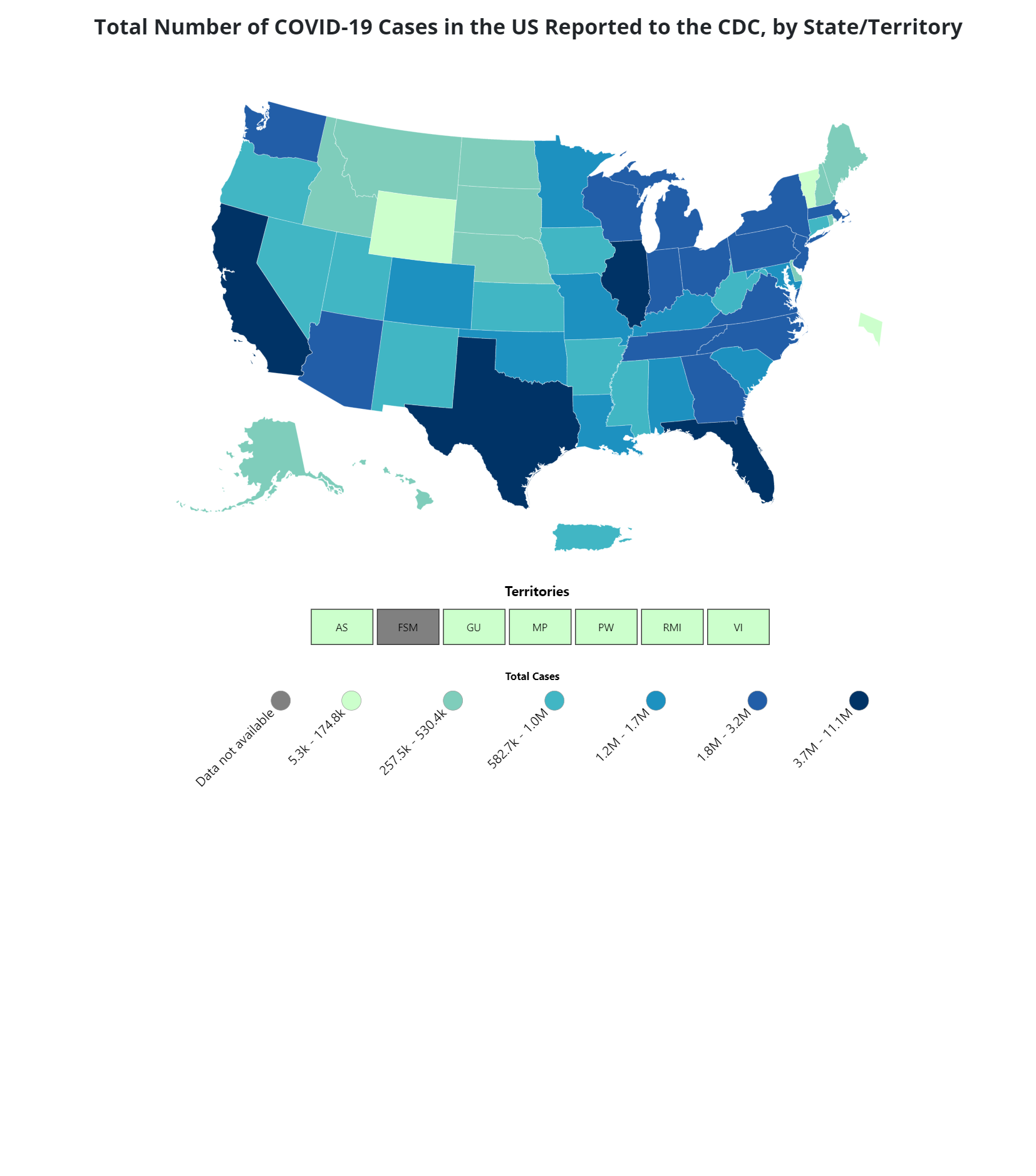
An example of the COVID-19 geographic map that inspired Larson to create a similar map of PSECU members and ATMs[3]
“We could see the concentration of members relative to ATMs and that helps us to know where we might need more ATMs, less ATMs, and even ATM functionality. Some accept cash (deposits) and some don't, for example,” she said. “It's shaded darker for a higher concentration of members, lighter for less radiuses on the ATMs for how far people are willing to travel to an ATM. And then the ATMs are color-coded to show their functionalities.”
Using data visualizations, Larson’s team could quickly make a mock-up of a geographical map like that but then also put the same data into a pie chart to see the percentage of members who live within various distances to an ATM, for example.
Ready to make the most of the data visualization feature in your new BI software? Here are some tips for next steps:
When in doubt, put yourself in the mindset of your audience. If you’re having trouble choosing the right type of visualization for a set of data, ask yourself who will be the audience and what questions they will likely have. Then select the type of chart that best answers those questions.
Be mindful of the visual element of data visualization. Larson says that style and design are almost as important as the data itself. For example, you probably shouldn’t color-code red for showing numbers that are increasing.
If you have the resources, get your creative team involved with brand standards. The creative design team at PSECU created brand standards and color palettes to make it easier for Larson’s team to focus on the data insights and make sure that they were using the right color schemes.
3. Unlock next level insights by using advanced analytics
The proliferation of artificial intelligence and machine learning over the past decade has enabled your business intelligence software to do some amazing things that border on predicting the future. This technology might seem daunting for new users, but it’s the key to unlocking the most powerful insights to help grow your organization.
Case in point: Larson’s team has been exploring data modeling and predictive analytics to help uncover where members are in their membership journey and what the next best credit union product might be for any given member.
“It's helped us with our marketing automation and targeted marketing,” she said. “It's helped us to get the right messaging to the right person at the right time.”
These advanced analytics tools might help Larson’s team detect patterns that indicate when a member that shares multiple demographic similarities with other members is in a prime position to open a money market account, as one example.
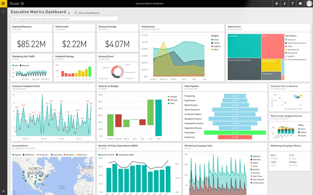
A dashboard displaying advanced analytics powered reports in Microsoft Power BI software (Source)
feature overview
Advanced analytics are an AI-boosted form of analytics that uses software to automatically prepare new analytics reports based on historic trends, scan billions of data points automatically, use machine learning to anticipate queries, and even explain findings to end users in plain language. Advanced analytics generally work on two layers: a visual layer, which is how the user interacts with the technology, and a backend layer, which is where the AI processes massive sets of data to unlock deep insights.
A key consideration for making the most of the advanced analytics in your new BI software is the data behind it. Advanced analytics relies on big data as the fuel to power these deep insights, and you can’t have one without the other.
If you’re worried that you don’t have a big enough data set to power advanced analytics, Larson has some reassuring words.
“Most places I've worked have more data than they think,” Larson said. “Take a look at what data you have and say, ‘Is there a question that I have based on this data that we can answer?’ So for example, a question a lot of people have is ‘How long will I have this customer or member?’ “
So even if you just have several years of historic data on when members leave and how long members stay, you can plug that data into your BI software and let the advanced analytics uncover demographic similarities that can unlock bigger trends. For example, you might find that members who recently opened a money market account typically remain members for at least another five years.
“It doesn't have to be perfect,” Larson said. “But from there, maybe you can get some data indications that'll help you understand that a little bit better. And you can always refine and get better. That's the fun thing about it. Just because you came up with a model once doesn't mean that you're done.”
Ready to make the most of the advanced analytics in your new BI software? Here are some tips for next steps:
Start collecting data as soon as possible. Think of data as the fuel that powers your advanced analytics. You’ll want to gather as much as you possibly can, and even if you’re just starting out you probably have more data already than you realize.
To get started, use whatever data you have on hand. Even if you’re limited to demographic data, or several years of financial reports, for example, you can use that data set to start exploring as you collect more.
Don’t be afraid to experiment. Predictive analytics are by nature an inexact science. Larson uses the example of a meteorologist. Even though weather reports aren’t always 100% accurate, every forecast yields more data to help make future predictions more accurate.
“Culturally, in order to go down that avenue, you have to be prepared to experiment and you have to be prepared to be wrong. And so if you don't have the grace from leadership or the team mentality that you're going to do your best and go for it, then you probably won't make it very far,” she said. “I always say that there is no perfect forecast. If you look at economists and even the weather forecast, you know you can never perfectly predict the future. But you can get fairly close.”
Use your new BI software to become the ultimate support team in your organization
The bottom line, Larson says, is to remember to use BI software in the service of others. Data analytics teams should not be in the business of working behind closed doors, gatekeeping data, and exploring that data based on their own whims. They should be in the business of protecting organizational data as a vital resource and translating it into a format that allows other teams to make the most of it.
“I view my team as being the ultimate support for every other team,” Larson said. “We're not frontline. We're not the ones doing stuff with this data and making business decisions. And so our job is to support the other areas to get the data they need in the format they need in a way they can understand it so they can make the data-driven decisions based on it.”
To help your analytics team become the ultimate support team in your organization, here’s a summary of the tips that we shared in this article:
New BI software users should focus on:
Simple, visually aesthetic dashboards
Consistent, interactive data visualizations
and Gathering data to feed advanced analytics.
By prioritizing those objectives, analytics leaders can make the most of their BI software in the short term and in the long term.
We hope that Larson’s experience has made you feel excited and empowered to start making more out of your own BI software. When you’re ready to explore more tips for making the most of your BI software, we have you covered with our business intelligence blog. Here are a few recent articles to start with:
Note: The applications selected in this article are examples to show a feature in context and are not intended as endorsements or recommendations. They have been obtained from sources believed to be reliable at the time of publication.