
When comparing the hundreds of different learning management system (LMS) options out there for your small or midsize business (SMB), you have to consider a ton of factors: cost, integrations, reporting, customer support. The list goes on and on.
But one factor is demonstrably more important than the rest, as Gartner points out in its “Market Guide for Corporate Learning Suites" (full research available to Gartner clients):
Place the learner's experience and the solution's usability at the top of the priority list for any new learning project.
Easy enough. You just have to find a super user-friendly LMS, right?
Oh, reader ... if only it were that simple.
Despite the technological strides made in their 20+ years of existence, LMSs still struggle mightily when it comes to usability. According to a 2017 study by Brandon Hall Group, only 33% of LMS users from small businesses with 500 employees or fewer say they're satisfied with their current system, and poor user experience is cited as the biggest reason why.
The problem is so pervasive and so detrimental, we estimate as many as 80% of LMS implementations at SMBs fail because leadership doesn't make usability and the user experience their top priority when evaluating systems.
The success of your training program, and thus your employee experience, hinges on employees not wanting to pull their hair out when they use your new LMS.
That's why we're here to look at the three most common user experience problems with learning management systems, and how you can identify systems with these issues during your search.
Problem #1: Navigation is a nightmare
The solution: Know what to look for during hands-on demos and study worker preferences
Every year, LMS vendors pack exciting new features and functionality into their platforms, from virtual coaches and real-time analytics to social learning capabilities and gamification.
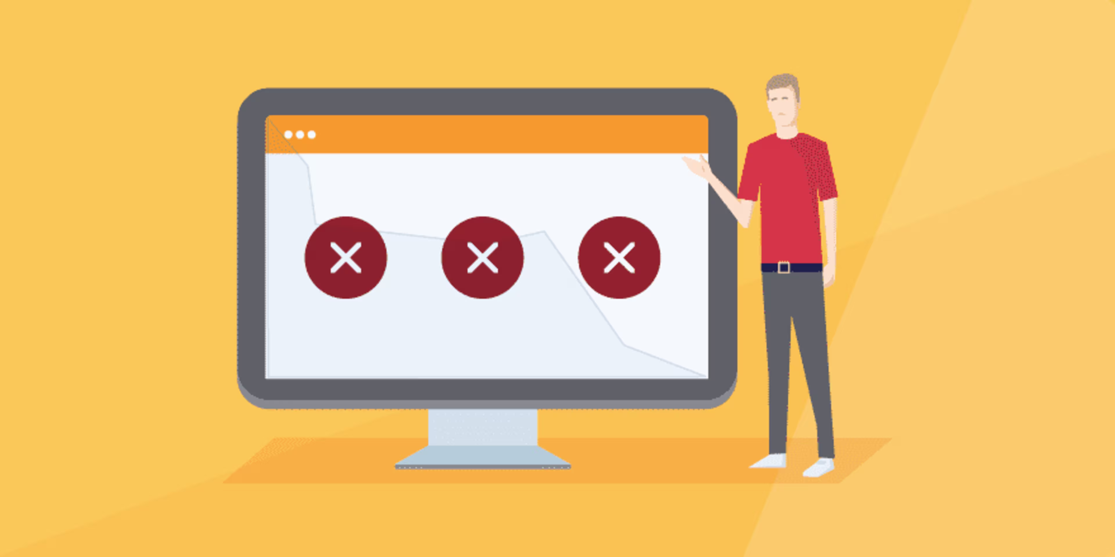
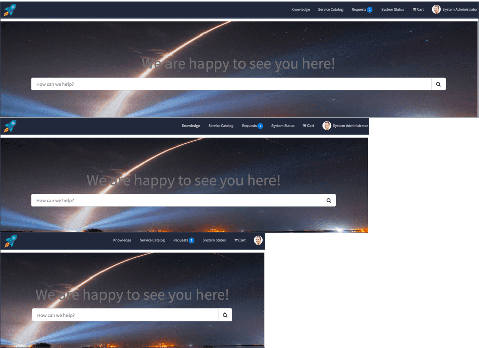
Then they link it all together with head-scratching, anger-inducing navigation.
A rough approximation of the navigation in every LMS ever (Source)
This LMS UX problem does double damage for businesses: Learners can't seamlessly jump between searching for courses, taking assessments, and tracking their progress; and trainers and managers can't easily find the tools they need to administer learning and create engaging content. Frustration ensues, and satisfaction levels plummet.
When vendors lead demos, they can easily skirt around these issues by following carefully curated paths, which is why it's important to get extended hands-on time with any system you're considering.
Here are some things you should look out for when it comes to navigation:
Does the LMS have search functionality? When you do a search, does it bring up relevant results?
Is navigation consistent between different modules or screens (e.g., menu items have the same names and icons and are in the same location on the screen)?
Can you get from one important module to another in three clicks or less?
Are menus overly cluttered?
Is it easy to backtrack and undo mistakes?
Are you allowed to customize navigation items and shortcuts? Do these permissions extend to individual learners so everyone can personalize navigation to their liking?
That last one is especially important because the truth is: There is no such thing as perfect navigation. Some users prefer a single-page view with a little bit of everything that your LMS has to offer, while others work better when functions are partitioned between different tabs.
As you demo different systems, have an assortment of workers sit in so you can learn their navigation preferences and uncover general trends that may influence your purchase decision.
Want to learn about hiring a UX design agency to help with your UX challenges? Our list of the top UX design agencies and their features will help you narrow your search. Read more in Capterra’s UX design agency hiring guide.
Problem #2: Courses are bland and unengaging
The solution: Look for robust course creation features and user feedback options
You want your employees to be excited about your new LMS. You're eager for them to dive headfirst into training because you know it will benefit your SMB in a number of ways.
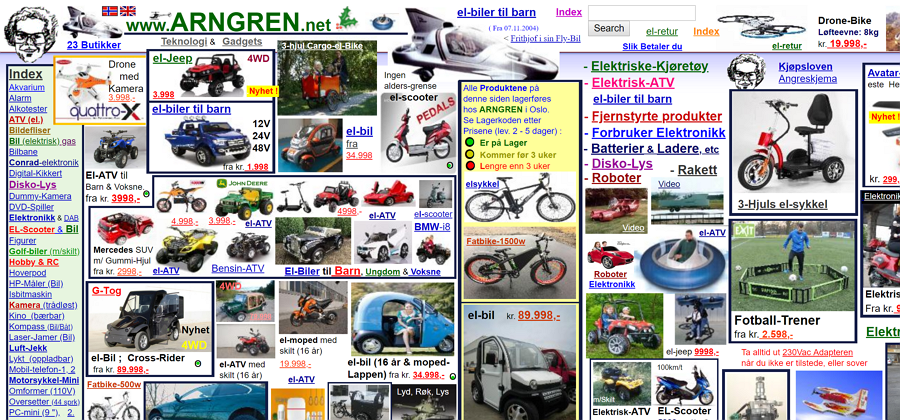
But that's never going to happen if your courses look like this:
What happens when you're given limited tools and assets to create your LMS courses (Source)
OK, this example is a bit of an exaggeration, but the fact remains that the courses you create in your LMS, if you don't have a stand-alone course authoring tool, are only as good as the assets you're given to make them. And in some cases, those assets can be extremely lacking or antiquated.
When 52% of workers under the age of 40 consider their company's current training methods boring, it's time to expect more from your LMS than stock images and simple assessments.
Here are some more advanced tools and features you should ask vendors about that can add a jolt of excitement and engagement to your digital training program:
Branching and personalized learning paths. Some LMSs allow administrators to personalize the sequence of courses that workers see based on how they perform in assessments or which courses they've completed in the past. Curating course sequences and serving up relevant content to each individual can keep them engaged.
Microlearning. Beyond the ability to break up courses into less time-consuming, bite-sized pieces, a good LMS should also allow you to deliver microlearning opportunities through other integrated systems workers use a lot, such as a CRM.
Discussion boards. Too often, eLearning happens in silos. Discussion boards give your workers a chance to interact with one another, revisit what they've learned, and gain new insights. Discussion boards have also been proved to increase training engagement and participation.
Simulations. Nothing can prepare employees for their day-to-day more than simulations of real-life work scenarios. If a vendor supports custom simulations, press them on how complex and involved they can get. You can even add an extra layer of immersion by incorporating virtual reality.
If you're not sure if your training programs are stale or not, that means you don't have good feedback mechanisms so workers can tell you. Features such as course ratings and post-course surveys can give you the data you need to make improvements, so seek them out in your new LMS.
Problem #3: Smartphones are treated as second-class devices
The solution: Learn the difference between different mobile layout designs and ask about dedicated mobile apps
In 2016, smartphones and tablets surpassed desktop computers as the primary devices used to access the internet worldwide. Mobile devices have become so ingrained in our work lives that 64% of learners says it's essential that they be able to access their training content from a mobile device.
All that to say, if your LMS of choice doesn't provide a good mobile UX, your employees won't be happy about it.
That's why it's important that you understand the difference between fixed, fluid, adaptive, and responsive layouts, because the way your courses look and act on mobile devices can differ drastically depending on which layout your LMS vendor uses.
1. Fixed layout
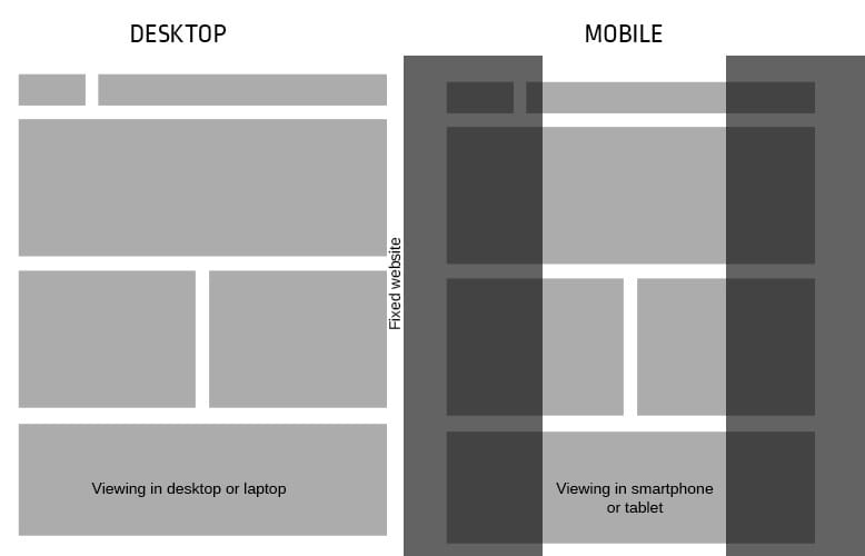
An example of a fixed layout (Source)
A fixed layout has elements that are set at a certain width in pixels. No matter what device a user is on, those elements stay at that same width.
As smartphone usage has grown, fixed layouts have largely fallen out of favor for obvious reasons. Because the elements on the page don't scale down for smaller screen sizes, mobile users have to scroll horizontally on fixed layouts to find things, or even just to read text, which is a giant pain.
It's highly unlikely you'll find an LMS in this day and age that uses a fixed layout, but if you do, avoid it like the plague.
2. Fluid layout
An example of a fluid layout (Source)
Also known as a “liquid layout," a fluid layout expands or shrinks elements on the page by a certain percentage based on screen size.
Fluid layouts get rid of the horizontal scrolling problem that fixed layouts have, but they also tend to make elements way too small on mobile devices, where everything is crammed together to fit on the tiny screen. Users then have to “pinch and zoom" their way around, which doesn't provide a good experience.
For this reason, fluid layout LMSs should also be avoided.
3. Adaptive layout
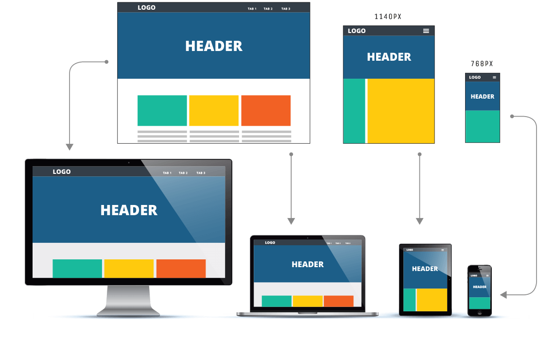
An example of an adaptive layout (Source)
An adaptive layout is essentially several fixed layouts that “adapt" based on the screen size of the user. If a user's window is between X and Y widths, they get layout A. If it's between Y and Z widths, they get layout B. And so forth.
The great thing about adaptive layouts is that you can customize the way your courses look for every screen size. The only drawback is that customizing different layouts for just one course on three different devices (computer, tablet, and phone) can take a lot of time. There's also the possibility that new screen sizes will emerge that aren't accounted for.
4. Responsive layout
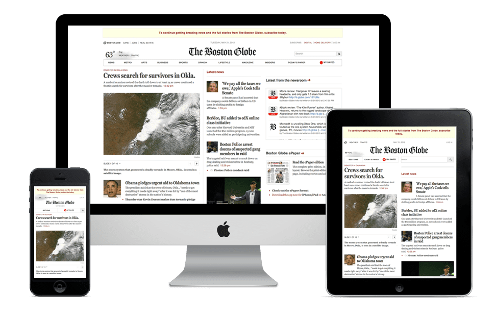
An example of a responsive layout (Source)
Responsive layouts are able to wrap text, scale different media, and rearrange the elements on the page automatically based on a user's screen size. A blend of fluid and adaptive layout principles, responsive layouts have become the preferred method for designing webpages and software systems for mobile devices.
You should ask LMS vendors if their system supports responsive layouts to ensure you're offering the best experience to mobile learners.
You should also ask vendors if they have a dedicated mobile app designed specifically with these devices in mind. If you head to our LMS directory, you can filter the results to only show systems that have Android or iOS apps.
Do your due diligence to avoid these common issues and more
LMSs have garnered a reputation as cumbersome, infuriating products for a reason. If you're not careful, you could end up with a clunky system that employees won't embrace.
Where other companies have faltered, though, you can prevail. By asking vendors the right questions, looking for certain things during demos and not compromising on your expectations, you can wind up with an LMS that delivers a great UX, as well as improved training results.
Capterra has a number of free resources to help you find that perfect system:
If you're looking for a list of the most user-friendly LMS products out there, you're in the right place. We do direct user testing to come up with our "Top 20 Most User-Friendly LMS Software" infographic.
Our LMS directory page is interactive and allows you to filter the list of products by ratings, features, and more to help you find the system that best fits your needs.